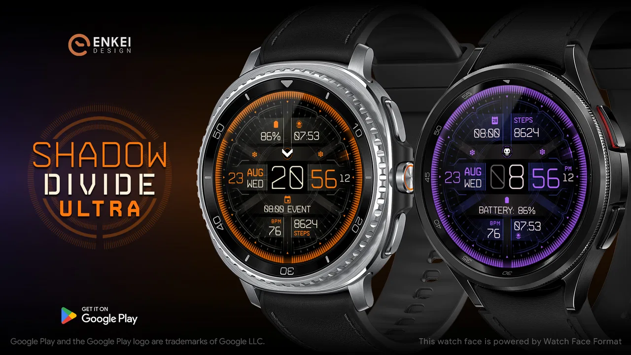
Shadow Divide Ultra - animated
- 4.5
- Rating
- 10.00K
- Installs
- $2.09
- Price
 Analysis by App-foxy
I approached Shadow Divide Ultra - animated as a personalization app rather than something I would open for long sessions. Its purpose is to change the feel of an Android device with an animated digital gamer interface, so the real test is not whether it offers endless content, but whether it makes the phone feel more personal without becoming annoying during everyday use. After spending time with it, I found a focused experience for people who enjoy a darker, game-inspired look and are willing to trade some visual restraint for atmosphere.
The app comes from Enkei Design and sits in the personalization category. It costs $2.09, is suitable for Everyone, and has built a 4.5 average from over two hundred ratings. That combination tells me it is aimed at a fairly specific audience: users who want a paid visual customization rather than another general-purpose utility. It has also passed the ten-thousand-install mark, which gives it a modest but meaningful user base without making it feel like a mass-market theme that everyone already has.
From a plain screen to a more personal setup
I start with the screen I already have, because that makes it easier to judge whether this visual change will fit rather than simply impress me at first glance. I’ll look at the balance between movement and everyday readability, then consider how a more personal setup holds up when the phone is in regular use.
You May Also Like

 AccuWeather: Weather Radar
AccuWeather Review: A Quick, Clear Forecast for Everyday Decisions
For everyday plans, the best forecast is the one you can understand quickly. AccuWeather makes rain timing, radar, and local conditions easy to act on, with a few trade-offs.

 Hill Climb Racing
Why Hill Climb Racing Still Turns Crashes Into One More Run
A tiny car, a bumpy hill and one more upgrade: Hill Climb Racing keeps resurfacing because its simple chaos makes every near-miss feel personal.

 AliExpress - Shopping App
AliExpress Makes Global Shopping Feel Personal, but Shoppers Bear the Risk
AliExpress turns a global marketplace into a pocket-sized discovery engine. Its reach is useful, its shopping loop compelling, and its trade-offs easy to miss.

 Lords Mobile: Kingdom Wars
Lords Mobile Is a Kingdom-Building Routine, Not a Quick Match
A case-by-case verdict on the building, battles, device demands, and social commitments that make Lords Mobile rewarding for some players and exhausting for others.

 PDF Scanner app - TapScanner
TapScanner Makes Paperwork Easier to Capture, Check, and Share
TapScanner makes scanning with a phone feel less like a rescue operation and more like a dependable step in getting work done. Its capture tools are useful, though not flawless.
 Block Blast!
 Shows How Much a Puzzle Game Can Leave Out
A quiet grid game shows why puzzle players increasingly value instant clarity, repeatable skill and low-pressure play—and where the genre still needs to catch up.
More From Our News Desk
View All News

The starting condition matters more than the store preview
Before using it, I considered what I actually wanted from a personalization app. I was not looking for a complete productivity system, a launcher replacement, or a tool that would reorganize every part of my phone. I wanted the display to feel less generic when I picked it up, especially during short moments such as checking the time, glancing at notifications, or placing the phone on my desk.
That distinction is important because animated designs can be attractive in a preview and tiring in daily use. A static wallpaper usually disappears into the background after a few days. Motion keeps drawing attention, which can be exactly the point for a gamer-style interface, but it also means the design has to remain comfortable when seen repeatedly. Shadow Divide works best when I treat it as an ambient layer for the device, not as a replacement for the phone's practical tools.
The visual direction is clearly more suited to someone who likes a dramatic digital mood than to someone who prefers soft gradients, nature photography, or an almost invisible background. I would choose it for a gaming phone, a dark home-screen setup, or a device where the owner wants the lock or home experience to have a stronger identity. I would skip it if my main goal were maximum battery simplicity or a completely quiet screen.
Setting expectations before paying
The paid price is low enough to be an easy decision for a committed fan of animated customization, but it still changes how I judge the app. A free wallpaper can be worth keeping even when it has rough edges because there is no financial commitment. With this app, I expect the presentation to feel deliberate and the everyday result to justify the purchase. That does not mean it needs to replace every other customization tool, but it should give me a clear visual reason to keep it installed.
The age rating of Everyone also makes it approachable for a broad audience. In practical terms, that means the appeal comes from the interface style and animation rather than mature themes. Parents or younger users can consider it as a visual personalization purchase, while experienced Android users will probably focus more on how naturally it fits their existing wallpaper and home-screen arrangement.
My first pass through the setup
I recommend beginning with the phone in its normal state instead of immediately rearranging everything. I first look at the existing wallpaper, icons, widgets, and color choices. This gives me a useful baseline: if the current layout is already busy, an animated interface may make the screen feel crowded; if the layout is plain, the app has more room to become the visual focus.
From there, I apply the design and spend a few minutes checking it in the situations that actually matter. I look at it in a bright room, in a dim room, with icons over it, and while moving between screens. This is a better test than staring at the preview because the visual balance changes once the phone's own controls and shortcuts are present. The best setup is not the most dramatic one; it is the one that stays readable after the novelty wears off.
A practical step-by-step workflow
My workflow is simple. I install the app, open it, inspect the available presentation, and apply the animated interface to the part of the phone where I want the effect to be visible. I then return to the home screen and check whether the motion competes with icons or widgets. If it does, I reduce the amount of visual clutter around it by removing unnecessary shortcuts or moving widgets to a less prominent page.
That last adjustment is easy to overlook. A customization app cannot make a cluttered home screen feel calm by itself. Shadow Divide has a stronger chance to look intentional when the surrounding layout gives it space. I find that a small number of useful icons and one clearly placed widget work better than stacking several panels on top of the animated background.
I also test the phone after locking and unlocking it several times. This catches a practical issue that a single application does not reveal: the design may look excellent while browsing the home screen but feel less useful if the first glance is dominated by notifications, a clock, or other system elements. The handoff between the app's visual layer and the phone's normal interface is where the experience either becomes seamless or starts to feel like decoration pasted on top.
Where the handoffs happen
The first handoff is from Shadow Divide to the operating system. The app supplies the visual identity, but Android still controls the basic interaction around it. I do not expect this kind of app to replace the system's notification behavior, app drawer, or device settings. Instead, I judge it by whether the animation remains compatible with those elements and whether I can continue using the phone without thinking about the customization layer.
The second handoff is between the home screen and individual apps. A good personalized setup should make the phone pleasant to pick up, then disappear when I start reading, messaging, working, or playing something else. Shadow Divide benefits from this limited role. It does not need to manage my tasks or interrupt my workflow. Its job is to create a visual entry point, and I prefer that narrow focus to a theme that tries to control every screen.
The third handoff is between the app and my wider device style. If my icons, widgets, and lock-screen elements use a completely different visual language, the result can feel mismatched. I would not buy this expecting it to automatically redesign every part of the phone into a unified system. I get a better result by treating it as the anchor and then making small supporting changes around it.
How I use it during an ordinary day
A realistic use case is a phone kept on a desk during work or study. I unlock it to check the time, glance at a message, or switch to a music app. The animated interface gives those brief interactions a more distinctive feel, particularly when the screen is visible between tasks. Later, I might use the same phone for gaming, and the darker gamer-oriented appearance feels more fitting than a generic landscape or a plain color.
Another use case is a secondary device used mainly for entertainment. On that kind of phone, I am less concerned with creating a neutral professional appearance and more interested in giving the device a recognizable personality. Shadow Divide makes sense there because the visual theme supports the role of the device instead of trying to serve every possible context.
For a work phone that needs to look restrained in meetings, the decision is less obvious. I can still use it, but I would keep the surrounding layout clean and make sure the animation does not pull attention while the device is sitting on a table. If I regularly need a calm, nearly static screen, a conventional wallpaper is probably the better match.
Small choices that improve the outcome
One useful approach is to separate the “showcase” screen from the “utility” screen. I keep the most visually expressive arrangement on the first home page, then place dense collections of apps on another page. This lets the animation remain visible without forcing every shortcut to sit on top of it. It also makes the phone easier to use when I am in a hurry.
A second tip is to judge the design with the brightness I normally use, not only at maximum brightness. Animated visuals often look impressive in a bright preview, but the real test is whether the contrast remains comfortable at ordinary indoor settings. If the interface becomes difficult to read, the problem may be the surrounding icons and widgets rather than the artwork itself.
A third trade-off involves motion and attention. I enjoy animation when I am casually checking the phone, but I do not want it to become a reason to linger on the screen. I therefore keep the home screen purposeful and avoid adding extra visual effects elsewhere. The result feels more like a controlled atmosphere and less like several competing animations.
A fourth insight is to evaluate it after a few days rather than after the first installation. The initial reaction is usually about novelty. The more useful question is whether I still appreciate the design when I am only unlocking the phone for a second. If the answer is yes, the purchase has done its job. If I start noticing the motion as noise, the app is no longer helping the device feel personal.
What it does well compared with usual alternatives
Compared with a standard static wallpaper, Shadow Divide offers a stronger sense of presence. A static image can be cleaner and more battery-conscious, but it does not create the same feeling of an active interface. The animated treatment is the main reason to choose this app, and users who specifically want movement will find the difference meaningful rather than cosmetic.
Compared with a full launcher or icon-pack setup, it is more focused and potentially easier to live with. A launcher can transform navigation, grid behavior, gestures, and app organization, but that also creates more opportunities for compatibility problems and setup fatigue. Shadow Divide lets me keep the phone's familiar navigation while changing its visual character.
Compared with free wallpaper collections, the paid model makes the experience feel more intentional, but it also raises the standard. Someone who changes wallpapers every few days may get more variety from a free collection. Someone who wants one distinctive animated identity and does not need a large catalog may prefer this narrower approach.
Compared with a manufacturer theme store, the app can appeal to users whose phones do not offer a gamer-style look that feels personal. The trade-off is that system themes may integrate more deeply with icons, menus, and settings. If complete device-wide consistency matters more than the specific animated presentation, the built-in option may be the wiser choice.
Where the flow breaks
The biggest possible friction is the boundary between visual ambition and everyday readability. An animated interface can look excellent when viewed alone, yet become distracting once notifications, widgets, and icons are layered over it. I solve much of that by simplifying the home screen, but users who do not want to adjust their layout may feel that the app never quite settles into place.
There is also a practical battery trade-off to consider. Motion generally asks more from a device than a still image, even when the difference is not dramatic in every situation. I would be cautious about using an animated customization on an older phone, a device already struggling with battery life, or a handset where I need maximum endurance. In those cases, a static alternative is more sensible.
The app is also not the right answer for someone seeking deep personalization controls across the whole operating system. Its value lies in the visual experience, not in replacing the phone's launcher, notification system, or productivity workflow. If I want to redesign every icon, gesture, and menu, I would investigate a launcher or a more comprehensive theme instead.
Another limitation is personal taste. The gamer-oriented styling is not neutral. It can make a device feel energetic and distinctive, but it may look out of place beside a minimalist work setup or a soft, colorful aesthetic. I would not recommend buying it simply because the word “animated” sounds appealing; the darker digital mood needs to fit the owner's existing preferences.
Who should install it
I think Shadow Divide is a good fit for Android users who want their phone to feel more like a personal gaming accessory than a generic communication tool. It suits people who enjoy animated customization, are comfortable making a few layout changes, and value atmosphere during short interactions. It is especially appealing when the phone already has a dark case, gaming accessories, or a home screen built around entertainment.
I would recommend skipping it if I wanted a completely static background, a large library of interchangeable designs, or a full system makeover. It is also a weak match for anyone who dislikes motion, needs the longest possible battery life, or prefers a very quiet businesslike screen. Paying $2.09 for a focused visual layer is reasonable for the right person, but unnecessary for someone who will disable it after the first day.
The result after the setup settles
Once I simplify the home screen and stop treating the animation as something to inspect constantly, the app makes more sense. It turns the first moments of using the phone into a small visual experience without demanding that I learn a new workflow. The result is not a productivity improvement, and I would not pretend it is. It is a mood and identity upgrade for the device.
My final view is that Shadow Divide earns consideration because it knows what it wants to be. Enkei Design has created a personalization app for users who want an animated gamer-inspired presence, not a universal tool for every Android owner. The 4.5 average and over ten thousand installs suggest that this focused idea has found an audience, while the paid price makes it best suited to people who already know they enjoy this style.
If your ideal phone feels active, dark, and unmistakably yours, this is a worthwhile visual change. I would install it on a personal or entertainment-focused device, give the animation room around the icons, and judge it over several ordinary days. If the screen needs to remain calm, highly efficient, and almost invisible, I would choose a static wallpaper or an integrated system theme instead. That clear dividing line is what makes the app easy to recommend honestly: it is not for everyone, but for the right setup, it gives the phone a character that the usual alternatives often lack.
FAQs for Shadow Divide Ultra - animated
01What is Shadow Divide Ultra - animated?
Shadow Divide Ultra - animated appears to be an animated entertainment or visual experience designed around dark, stylized shadow-themed content. Before downloading, users should check the store listing carefully to confirm its exact category, supported features, developer information, and whether it is an interactive game, animated wallpaper, media app, or another type of application. The title alone does not clearly explain its full purpose.
02Is Shadow Divide Ultra - animated free to download and use?
The application may be available as a free download, but users should review the Google Play or App Store listing for possible advertisements, optional purchases, subscriptions, or restricted features. Some apps provide basic content at no cost while charging for additional animations, customization tools, or an ad-free experience. Always verify the current pricing details before installing or entering payment information.
03What permissions might Shadow Divide Ultra - animated request?
Permission requirements depend on how Shadow Divide Ultra - animated works. If it only displays animations, it should generally need limited access, although wallpaper, notification, storage, or display-over-other-apps permissions may be requested for certain functions. Read every permission prompt carefully and avoid granting access that seems unrelated to the app’s purpose. You can also review permissions later in your device settings.
04Will Shadow Divide Ultra - animated work on my Android or iPhone?
Compatibility can vary according to the app version, operating system, device model, screen resolution, and available storage. Check the official store page for the minimum Android or iOS requirement before downloading. Animated content may also use more battery, memory, or processing power than a standard static application, so older phones could experience slower performance, reduced battery life, or occasional visual glitches.
05Is Shadow Divide Ultra - animated safe to install?
Users should download Shadow Divide Ultra - animated only from an official Google Play or Apple App Store listing and confirm the publisher, ratings, recent reviews, update history, and privacy information. Avoid unofficial APK files or modified versions, as they may contain unwanted software. Because app details can change, examine the current data-safety or privacy labels and uninstall the app if it behaves suspiciously or requests unnecessary access.
Pros
- Smooth animated visuals create an engaging
- cinematic atmosphere.
- Fast-paced gameplay keeps short sessions exciting and easy to revisit.
- Distinctive character designs give the game a memorable visual identity.
- Responsive controls make movement and combat feel natural on mobile.
- Offline play is convenient when you have limited or no internet access.
Cons
- Animations and effects may drain the battery during longer sessions.
- Small-screen controls can feel cramped during intense action.
- Progress may become repetitive after extended play.
- Older devices may experience frame drops or slower loading.
- Limited accessibility options could affect some players’ comfort.

Shadow Divide Ultra - animated
Gallery